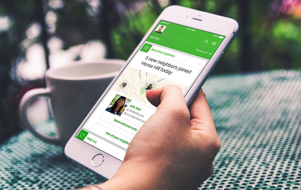
FT Paywall
A big leap
Having already performed a series of small experiments (see Part 1), we were always trying to think of an end goal of what the paywall would look like in the future. As such, we wanted to move away from small experiments and think bigger.
For this project, I worked as a UX Designer, alongside our UI Designer, James Drayson and Claire Parker, Product Manager. At a later date, I would take over the visual design as we made the switch to Product Designer .
A fresh look at the landscape
We had already learned a lot about our customers behaviours when it came to the paywall. In line with improving satisfaction and survival rate from trials, we focused on matching subscribers to the right package for their needs.
So we need a new start and reworked our Hypothesis accordingly.
By matching the right person to the right package at the right time, subscribers will choose the right package that reflects their usage needs, increasing conversion and long term satisfaction
Running a Workshop
For a fresh perspective, I put together a workshop pulling in the wider members of the team working on the barriers, including key stakeholders from Marketing, Editorial, Product, Research, Data analysis, Design and Tech.
Over several years of iterations, I’ve developed a 4 stage framework to get the best out of workshops:
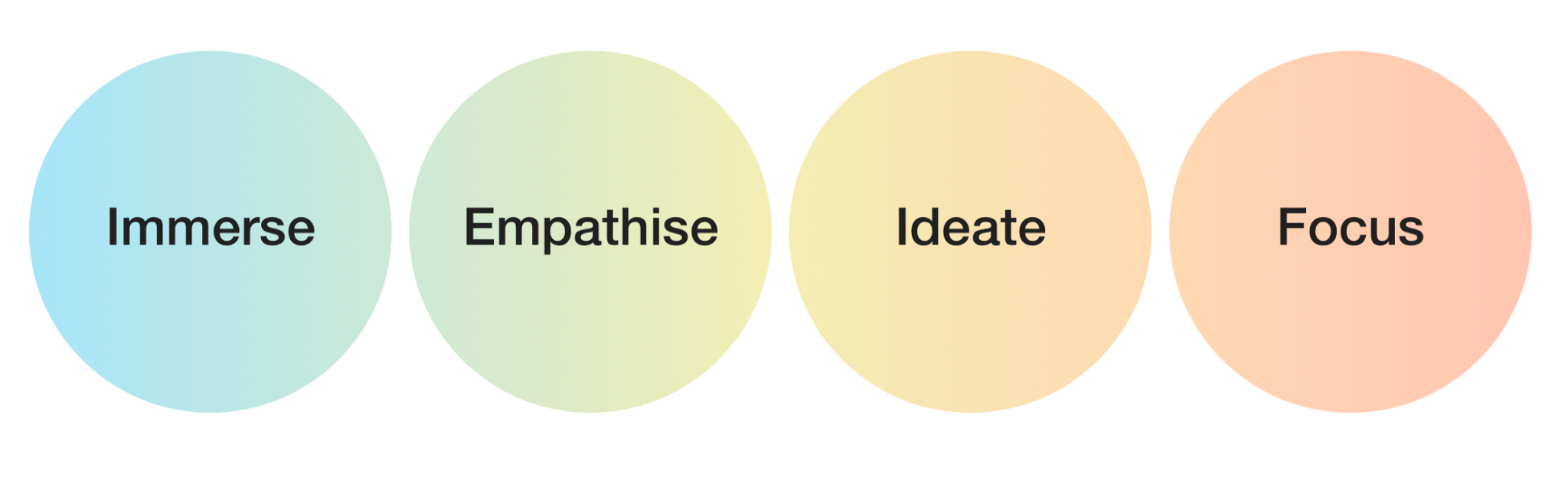
Workshop framework. Copyright Simon Coxon
Immerse — Play back what we already know to stimulate thinking
Empathise — Put yourself in the shoes of the user to understand their problems and needs
Ideate — Generate a breadth of possible ideas
Focus — Refine and focus thinking to provide a clear direction
Immerse
Ideas don’t get generated in a vacuum. Our first stage, Immerse, was to play back everything we had learnt from our previous experiments and learning (See Part 1). This was supplemented by ongoing studies from our Research team and Behavioural insights from our Editorial and Data teams.
We used a playback of our personas (below) to provide a reminder of our types of subscribers and their needs and behaviours.

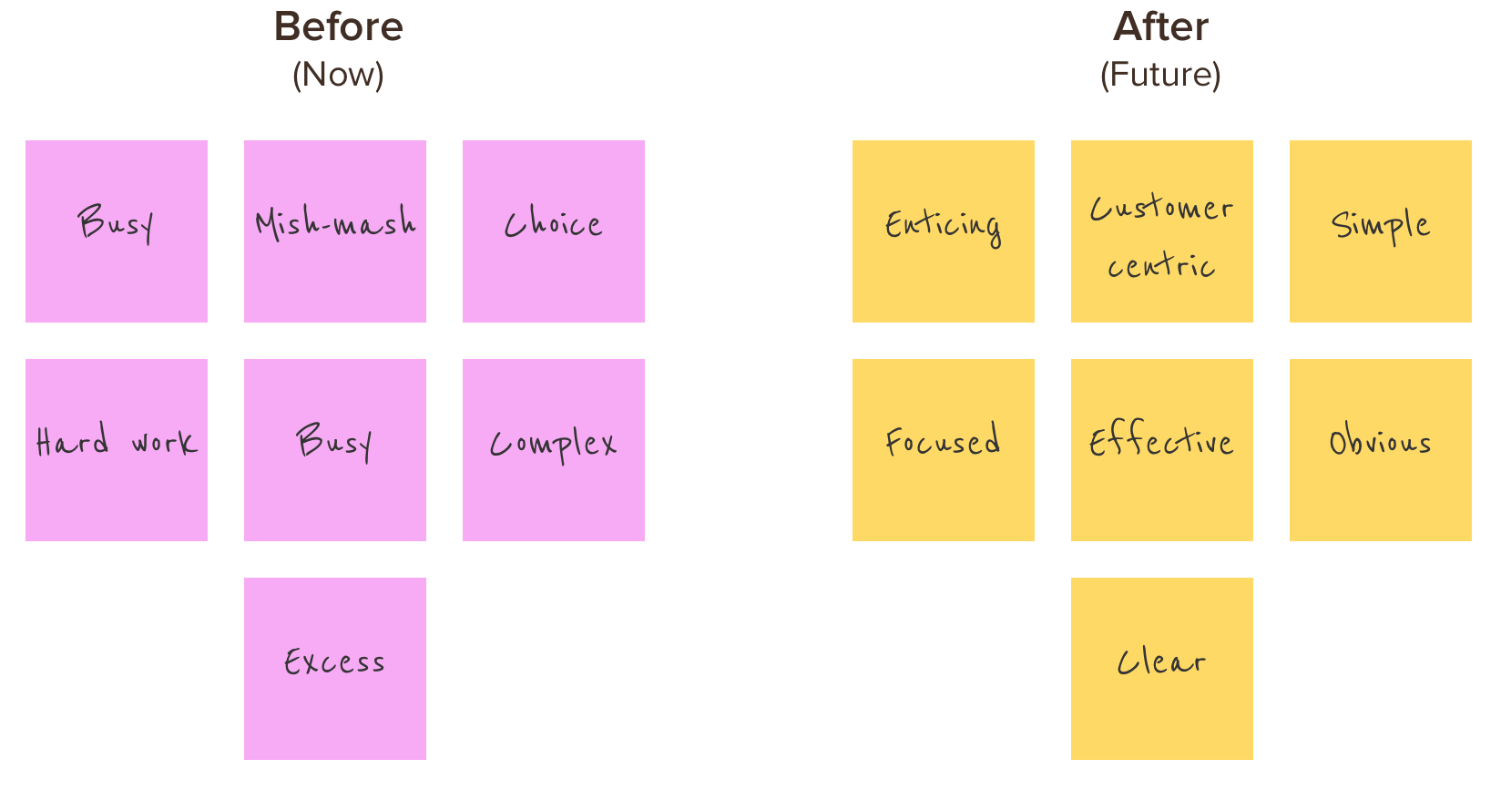
Warm up
Some attendees would have preconceived ideas around the current barrier. I wanted to focus on what our ideal, utopian state would be, to leave the past behind.
We were able to label the ‘Now’ state with negative connotations, allowing us to move forwards for the positive change desired in the ‘After’ state.
Empathise
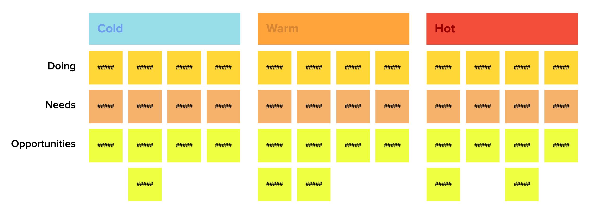
Our second stage, Empathise formed of an activity that would seek to group our prospects into different sets of behaviour.
Few people make a high purchase decision without several rounds of consideration. With this is mind and using the research and data provided, I had split the group into 3 key cohorts:
Cold
No desire to get an FT subscription. Low awareness of the FT and see the paywall as a big inconvenience.
Warm
Medium interest and awareness of the FT. Low propensity to act.
Hot
Close to converting. External forces might be holding them back (time, cost). High interest and awareness of the FT and understood the value of a subscription.

The aim of the exercise was simple:
How might we move….?
Cold > Warm
Warm > Hot
Hot > Sub
Using a framework based on Empathy maps, I created an activity that used the context of the situation someone might be in when they saw the barrier, adjacent to the task based needs of that moment and in the broader space of their career.
These would be used to then look at possible opportunities that would be relevant to each individual group.
A quick dot voting round surfaced the strongest opportunities. It’s amazing how powerful people feel, armed with 5 green sticky dots!
Ideate
Having put themselves in the shoes of the user, we then moved into taking the opportunities from the Empathise session and turning them into storyboards for the Ideate stage. Even a simple sketch can communicate the promise of a great idea.
In pairs, the groups drew the story of their idea and articulated what was happening at each step. The images below captured what was going to become our most successful experiment to date.


Focus
The idea that was eventually picked to move forward was concepted by colleagues from Marketing and Editorial.
We dot voted again for our favourite ideas. We had several strong options, but the clear winner was Dynamic content based on the journey.

Prioritising from a set of strong ideas
We couldn’t solely rely on the dot voting to decide on our priorities, so we used the RICE method to guide our decision:
Reach: How many people will this impact? (Estimate within a defined time period.)
Impact: How much will this impact each person? (Massive = 3x, High = 2x, Medium = 1x, Low = 0.5x, Minimal = 0.25x.)
Confidence: How confident are you in your estimates? (High = 100%, Medium = 80%, Low = 50%.)
Effort: How many “person-months” will this take? (Use whole numbers and minimum of half a month – don’t get into the weeds of estimation.)
R x I x C divided by Effort
We quickly made assumptions that journeys could be based on location or by content - each requiring minimal development. The ‘Dynamic Barrier’ had the highest score by some distance.
Testing our hypotheses

We had direct access to FT readers and prospects in a local coffee shop. We tested early designs, got quick, visceral responses, iterated and tested again.
In fortnightly user panels, we tested more solid ideas, where we were able to ask more in depth questions.
With each session, we tweaked our copy and our visuals until they resonated with our audience.
An extraordinary A/B test
We ran an A/B test over an 8 week period, against the existing control (from Part 1). The barrier would change depending on the topic or location.
Topics were high performing reads from Cryptocurrency, Markets and Brexit. We picked up traffic to the USA and Australia, serving each territory a custom paywall.

The ‘Brexit’ Barrier hit a 22% rise in conversion rate, compared to the control. This was a phenomenal leap. The range for the topics based barriers were 17-22%.
For the regions, the Australian barrier didn’t reach significance due to low traffic, but the USA barrier was successful at 14% uplift on conversion.
None of us expected such incredible results, particularly when previous experiments on the paywall had made small shifts or had proved insignificant.
(at this point, a slight tangent)
Transforming the team
from UX/UI to Product Design
A number of our design teams were disharmonious and inefficient. Speaking to Product Managers, UX and UI Designers, no one was happy with the situation. We needed a change.
The UX/UI Problem
Our teams were poorly organised. Research and Data were external resources, working across multiple projects. Often, we couldn’t access these assets and had to build insights from the information at hand.
Some teams had good working relationships between UX and Visual Designers, but others barely spoke. In every case, the delay between wireframes and visual design took far more time than needed.

Paths of communication for a disconnected team. Low/slow performance. Research and data are external resources.
Nuance was being lost in translation, changing the way elements should behave. Or Visual designers changed an experience on a whim. This created conflict between pairs and left everyone unhappy.
There was limited need to keep designing using wireframes. We had a mature enough set of visual styles and components to design rough mock ups that were close enough to the real thing, without going through separate UX and UI stages.

Highly connected and communicative team. High performing.
With the Product Designer taking over both roles, this would speed up the design work. We ensured that ‘constant communication and collaboration’ was the cornerstone of how we worked. Understanding and alignment improved throughout the whole team.
We embedded research and data into teams. Co-location, even for a day or two a week meant conversations were more frequent and allowed for deeper thinking.
I led the transition for the whole department to move into having single Product Designers within streams.
(end of tangent)
Continuous iteration
By now I had taken over the Design reigns. We had been successful in an A/B test, but we could only learn more by speaking directly to users. I collated back the insights from previous experiments and then used these to guide our questioning with another panel.

Through speaking to customers and our own critique, I identified a set of aspects we needed to improve:
Strip back unnecessary navigation
Keep text contextual, relevant and minimal
Provide price transparency - match billing to reduce mental arithmetic
Preserve reading flow and remove visual interruptions
Designing for Desktop and Mobile,
Side-by-side
Split of visits was still approximately 65% desktop to 35% mobile, but we had seen the pattern of this moving to being more balanced.
Rather than going fully mobile first, I favoured Side-by-side to keep both experiences consistent and optimised.


Prospects were most likely visiting on multiple devices - so when they eventually had the intrinsic motivation to act, that experience needed to be familiar and easy to act upon.

Nearly 2 years on from when I first started working on the paywall, it felt like we had really caught up with our competition and were providing a high converting experience that also benefited the long term happiness of our customers.
There also comes a point where you’ve reached the peak of returns from the improvements you make to an experience. At that point you have to question where you can make the most impact for your effort and allocate resource accordingly. Beyond this experiment, other projects beckoned.
Conclusion
By putting in the time and space to think, with a group of diverse people, we were able to match up the needs of the users to our proposition.
By reflecting back to prospects the content they were trying to read, we affirmed to them in the simplest way possible that the FT had the content that they wanted to access.
It was the emotional response that we triggered, not a logical one, that led to the improved conversion. Emotions are a powerful part of any decision making process and if you can identify individual drivers, even on a most basic level, this can still have a potent effect.