FT Paywall
A series of small experiments
Being a subscription based business, if you try and read an FT article and you aren’t a subscriber you are shown the paywall (also called the barrier).
Below, is what the paywall looked like in 2017.
From a big piece of research performed the previous year, we already knew there were some major opportunities to optimise the subscription journeys and it was clear we could make improvements here.
For this project, I worked as a UX Designer, alongside our Visual Designer, James Drayson and Claire Parker, Product Manager.

The old FT Paywall in 2017
What did we already know?
Behavioural insights
Peak hours are 6am to 10am (UK time)
Accessing on commute on phone then switch to desktop when they reach the office
Smaller peaks - lunchtime > US West coast wakes > home commute
98%+ of barrier traffic is anonymous
Data insights
CTR barrier to form 1.2-1.5%
Avg time on page < 2 secs
Trial Cancellation at 1m 75%
Payment form to conversion 2.4%
Known customer problems
High frustration of not being able to read their chosen article
Not mobile optimised
Price shock at 1 month for trials
Packages weren’t reflecting their needs
Speaking to customers
These were all valuable insights, but we also wanted to dive deeper and perform generative research by speaking to prospective subscribers. We organised small groups and interviewed the participants to discover their needs, pains and problems.
We also used this as an opportunity to put our current paywall in front of participants to get their reaction.

“I can’t work out what I would get with Premium and I what I get with Standard. It’s not clear what I would have with that”
Generative research learnings
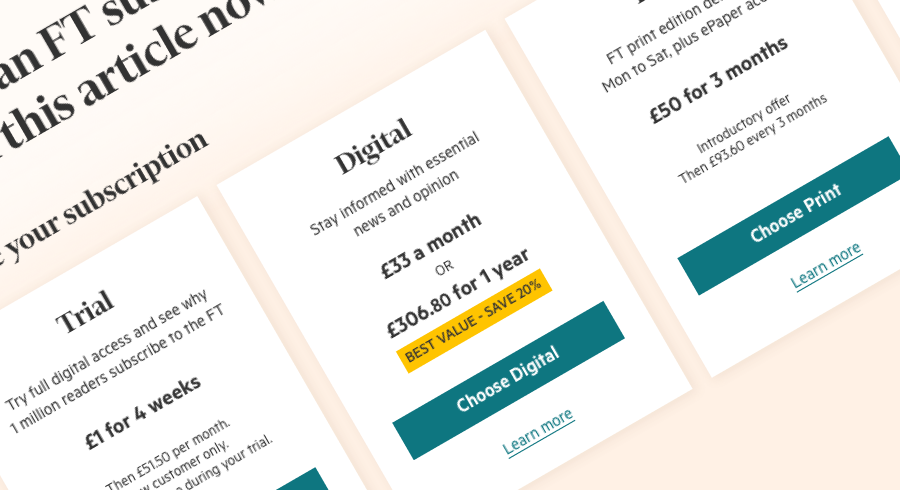
Pricing lacked transparency. Participants tried to make the calculations of what it might cost over a month and a year but struggled.
Images were too small and didn’t convey any useful information
Packages were hard to decipher and hard to compare
Choice paralysis kicked in, particularly with participants who noticed the other ways to subscribe.
Iterations from A to C
We distilled our thinking into a Hypothesis
By clearly articulating the benefits of an FT subscription and its cost, we will better enable prospective subscribers to choose the right package that reflects their usage needs, increasing conversion and long term satisfaction
and we created a set of measurements
Barrier to form CTR as an indicator
Barrier to form CVR 2.4% - Target +5%
Trial survival rate at 1 month 25% - Target +5%
Retention - Survival at 17 weeks 88% - Target +3%
We identified down the top level things we wanted to improve and began to prioritise a testing plan.

To get from A, where we are now, to B, our utopian future state, we planned a series of smaller experiments to learn as we went along.
The future state is rarely what we expect it to be from our imagination, but is formed by what we learned our experiments.
This iterative approach takes us not from A to B, but more from A through a series of B’s to C.

Below are some of the experiments that got us to our own ‘C’ state.
Some of these worked, but just as important are the ones that didn’t work. I always avoid the word fail, because we learned things from all of these and they helped us improve iteratively.

Using my wireframes as a guide, James created several different designs (below).
Several of these were used in either coffee shop tests, focus groups or live A/B tests.


What did we learn from our tests?
Colour can be confusing, particularly when used in arbitrary ways
Pricing should be transparent and model the expected payments that come from an account
Comparison tables only work as like for like comparison of directly related things
Our ‘package’ images weren’t enabling any sort of comparison and were so small they were distracting decision making.
We needed to reduce the sheer amount of noise that was in our designs. Whether in excess language, colour or information.
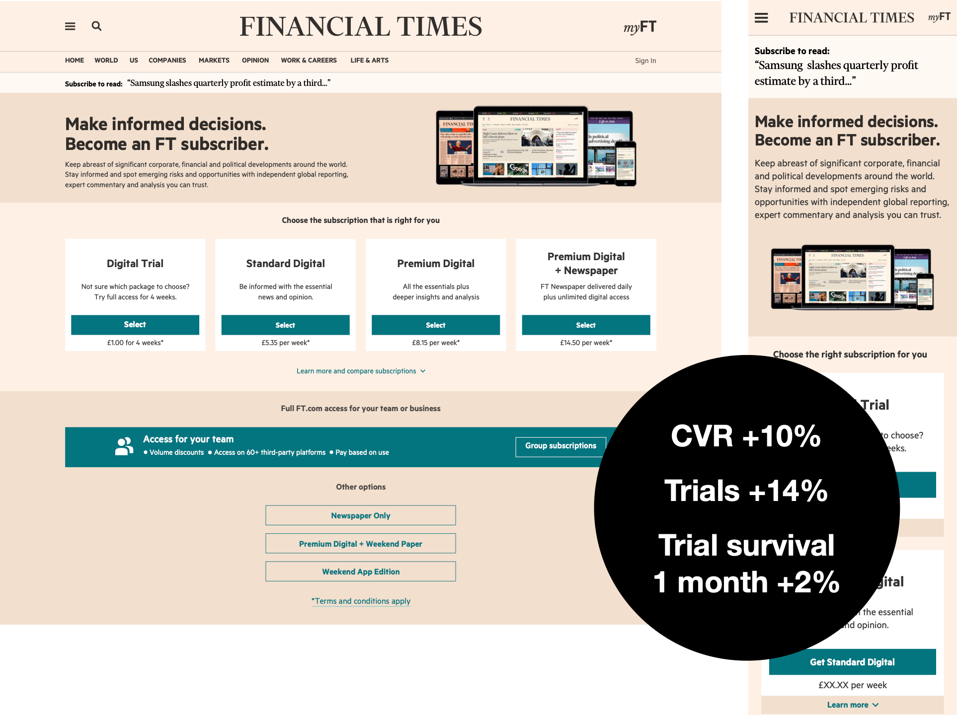
A happy accident from mobile
Despite, two years previously, the FT had rebuilt their site to be mobile optimised, the paywall for some reason was omitted. It was an obvious decision to make sure people visiting on a mobile were given an experience that suited them.
Initial designs were quickly formatted into mobile breakpoints and styled using CSS, with exactly the same content as the larger breakpoints. This resulted in a LOT of scrolling due to the large amounts of copy. This sat live for a couple of weeks while we implemented a better experience.
We opted for expanding copy that could be viewed by tapping ‘Learn more’. This made the page more compact and made the page less overwhelming. When we saw that the conversion rate leapt up 8% from the version with long copy, this got us thinking…
With no supporting copy, was it easier to make a decision?
With this in mind, we put together a desktop version that used the same pattern of having expanding copy. The results were staggering.
Overall conversion rate increased by 10%.
Trial survival at 1 month increased by 2%.
Less information was helping people to choose what they wanted and find a product that better suited their needs.
Conclusion
Whilst there is a strong desire to perform small iterative tests, these only really result in small changes in measurements, negative, flat or positive. It’s only when we jumped in with bigger bets that we moved things like conversion rate by large margins.
However our learning from the smaller tests can be put into effect across a lot of the things we build as discoveries like limiting colour and reducing noise in decision making are universal.
By having so many iterations we now have high confidence of knowing what gets turns a casual reader into a subscriber.